Georgia O’Keeffe said, “I found I could say things with color and shapes that I couldn’t say any other way—things I had no words for.”
Me, too, Georgia, except that when I wear my event designer hat, those colors and shapes are transposed from a canvas to a ballroom.
Experts know that color has an energy and other attributes that affect our well-being, safety, moods, and behavior. Designers of hotels and event venues know the physiological and psychological reactions and benefits of using particular colors. Meeting and event designers know color principles that help them transform the energy of an event and evoke a response in attendees.
Meeting planners need to realize the important implications of color choices—it’s a lot more than decor. Think about these questions, for example:

1. What are the client’s corporate colors?
What color is the logo? Many logos are transferable from one color to another based on usage but many are not. This area is monitored and controlled by in-house marketing and sponsorship and must be respected to represent a company properly.
2. How does the color translate on a foamcore sign, vinyl banner, spandex, or through a light box?
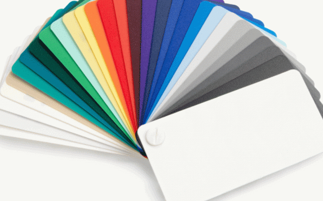
All colors used in graphics and printing are associated with a Pantone Matching System, or PMS, color. Pantone has a color guide that planners can purchase. It is critical to test the results of a PMS color on the above materials prior to a meeting. No one wants the head of marketing to enter a room and see fuchsia on an overhead light box when it should appear as red.

3. What are the competition’s colors?
Understand the correlation and how brands use color. The red of Coca-Cola, the brown of UPS, TDBank’s green, Citi’s blue, and Yahoo’s purple all have distinct correlations in our memories. This is because color is a non-verbal language. Your company’s logo and graphics are instant identifiers to the brand. For planners, this means being aware of the colors of the linens, floral arrangements, marketing graphics, etc., to be used at an event.
4. What color is the hotel space/carpet/furniture? Will it “disappear” in the dark or will it distract?
Many clients are concerned with the effect of brightly colored linens or drapes or other built-in color features of a room. My test is to look at the colors when the room is darkened. This way you can feel and see the effect. Be bold the next time you are planning a dinner and try a really bright color! Contrast works!

5. How can I give badges and signs the most color impacct?
Don’t be too creative with color on practical elements like badges and signs. We read one-inch-high letters up to 30 feet away. If you want attendee names to be seen on a badge, use a color that will provide the most contrast to the badge color. If your badge color is white, use black or dark blue but never yellow, orange, or pink, as they disappear.
6. What are the cultural influences to specific colors?
Failure to understand the meaning of color in different cultures means leaving yourself open to huge mistakes, such as using a color that means death or insult. Color responses are based on learned behavior and must be understood in today’s global society. Ask local experts when working in a destination to help you understand.

Finally, I’ll leave you with two questions.
First, does a brown piece of luggage weigh more than the identical design in white? Answer and explanation next time!
And second, what color do you feel today?
Dianne Devitt

